Cotswold RAW
Editorial Design
Digital Design
Social Media Design
Cotswold RAW is a family-run pet food brand producing natural raw meals for dogs and cats. Their feeding guide booklets had gradually become overloaded with information, making important nutritional advice difficult to find when customers needed it.
I redesigned the guides around a stronger information hierarchy, reorganising content to improve the way it is read and understood in real use.
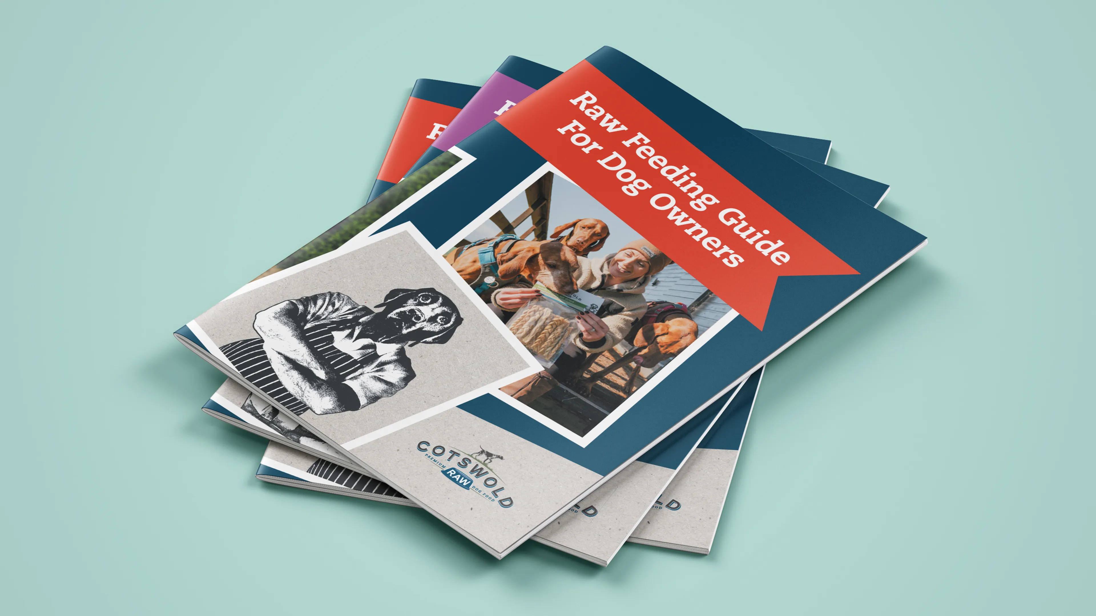
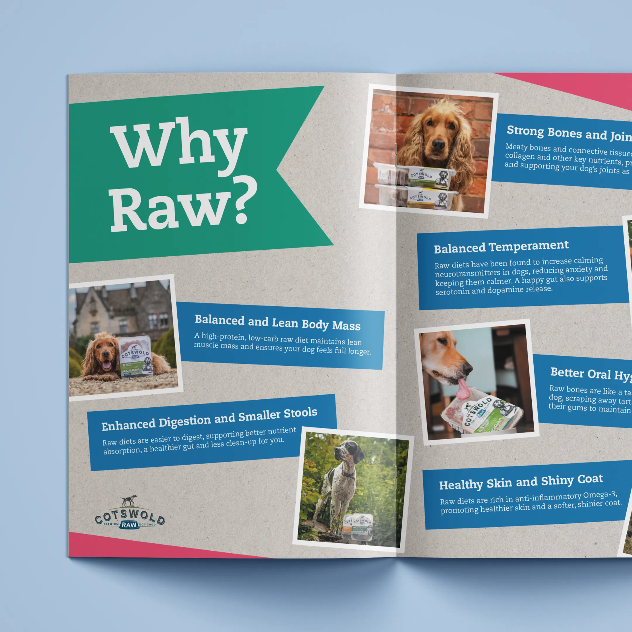
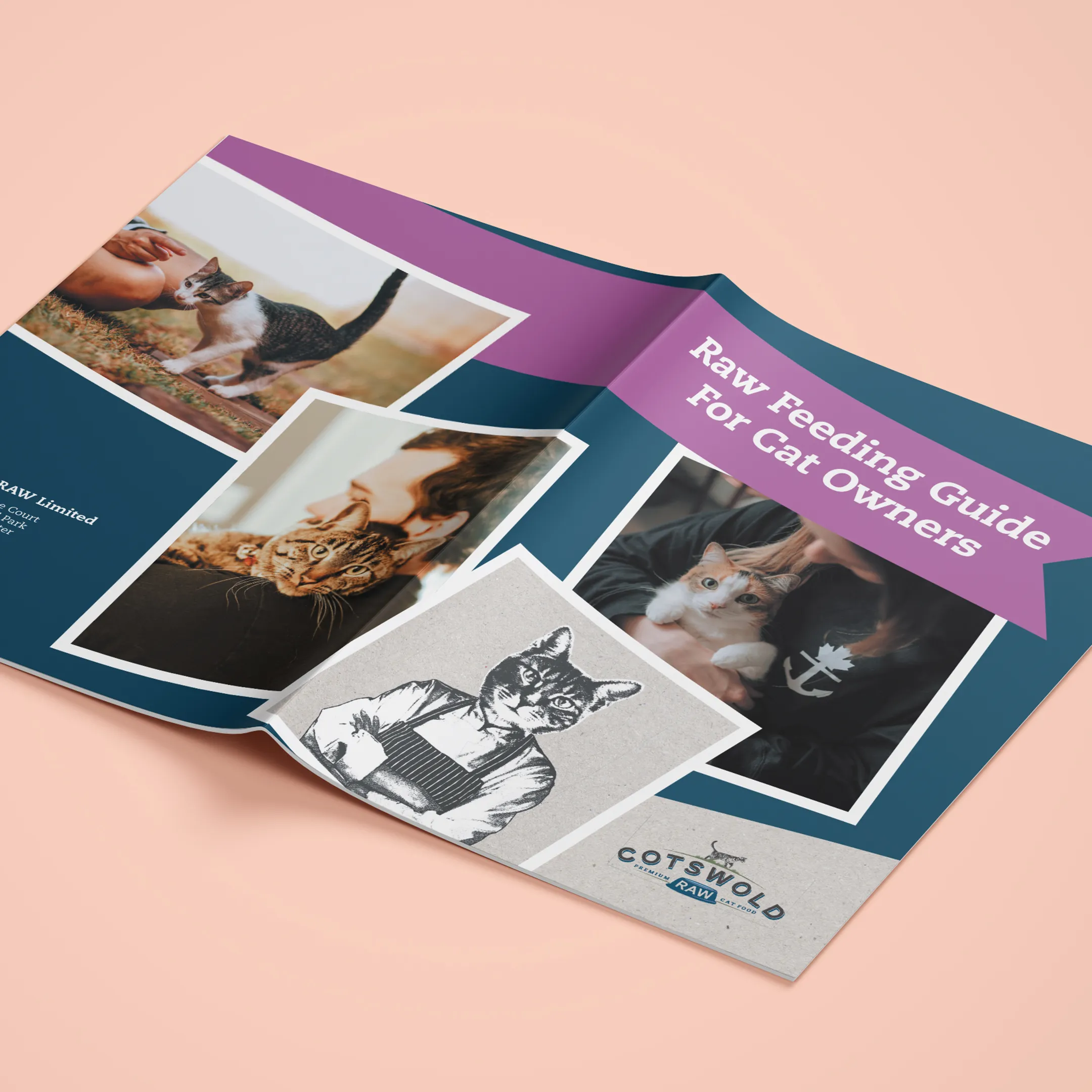
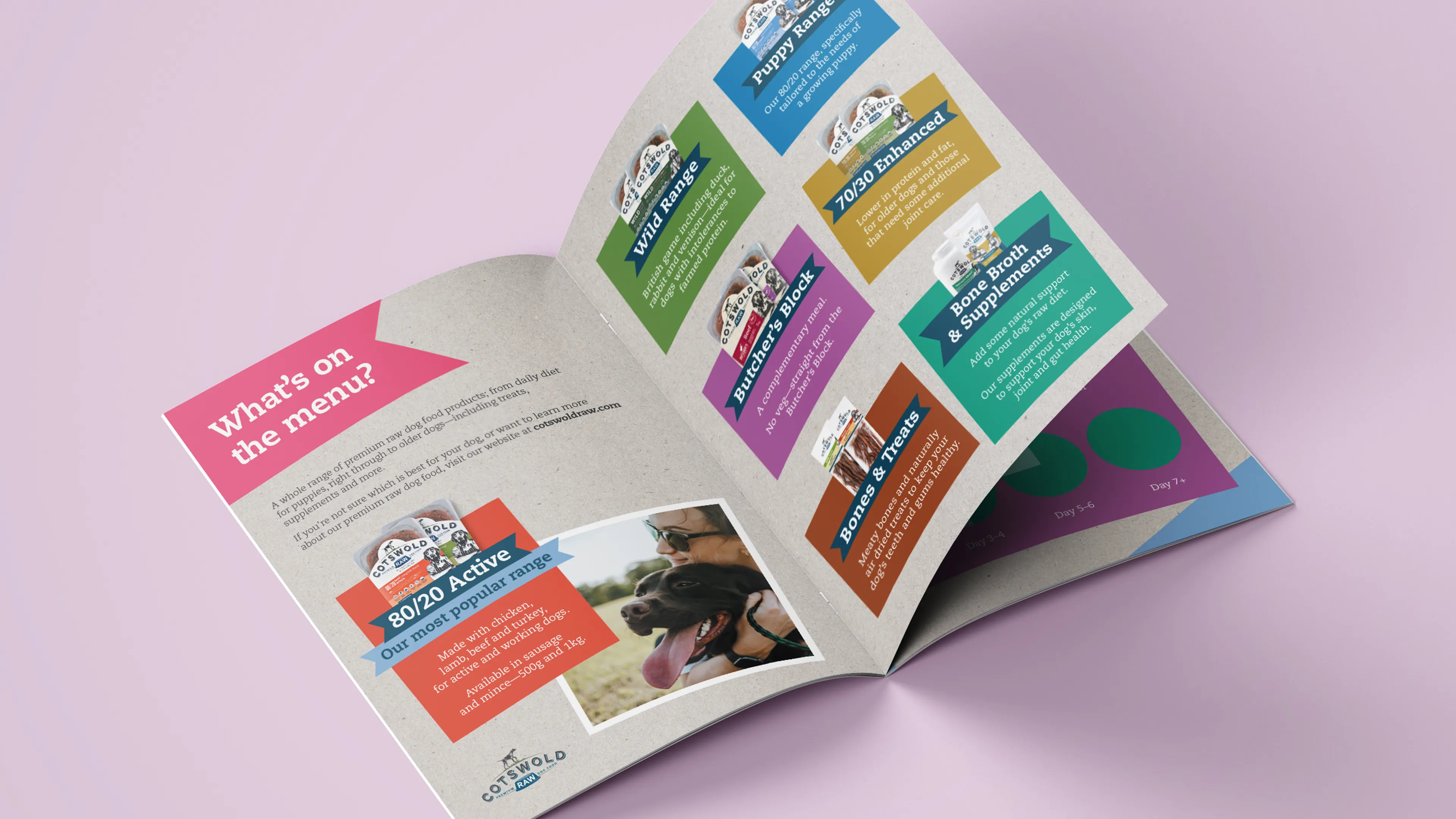
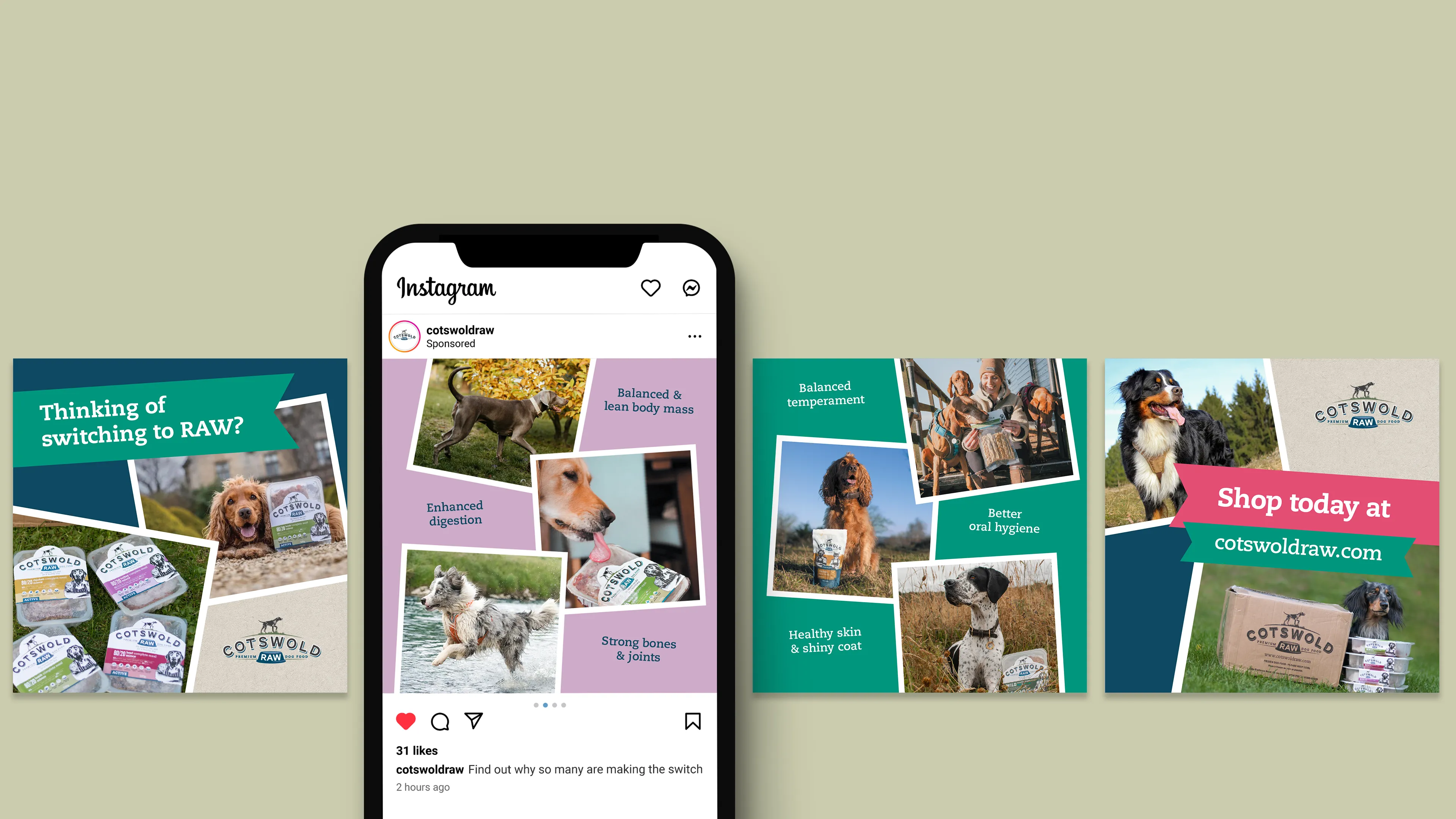
A more structured interpretation of the brand’s collage-led style, supported by a broader use of the existing colour palette, created clearer separation between sections while retaining the personality of the brand.
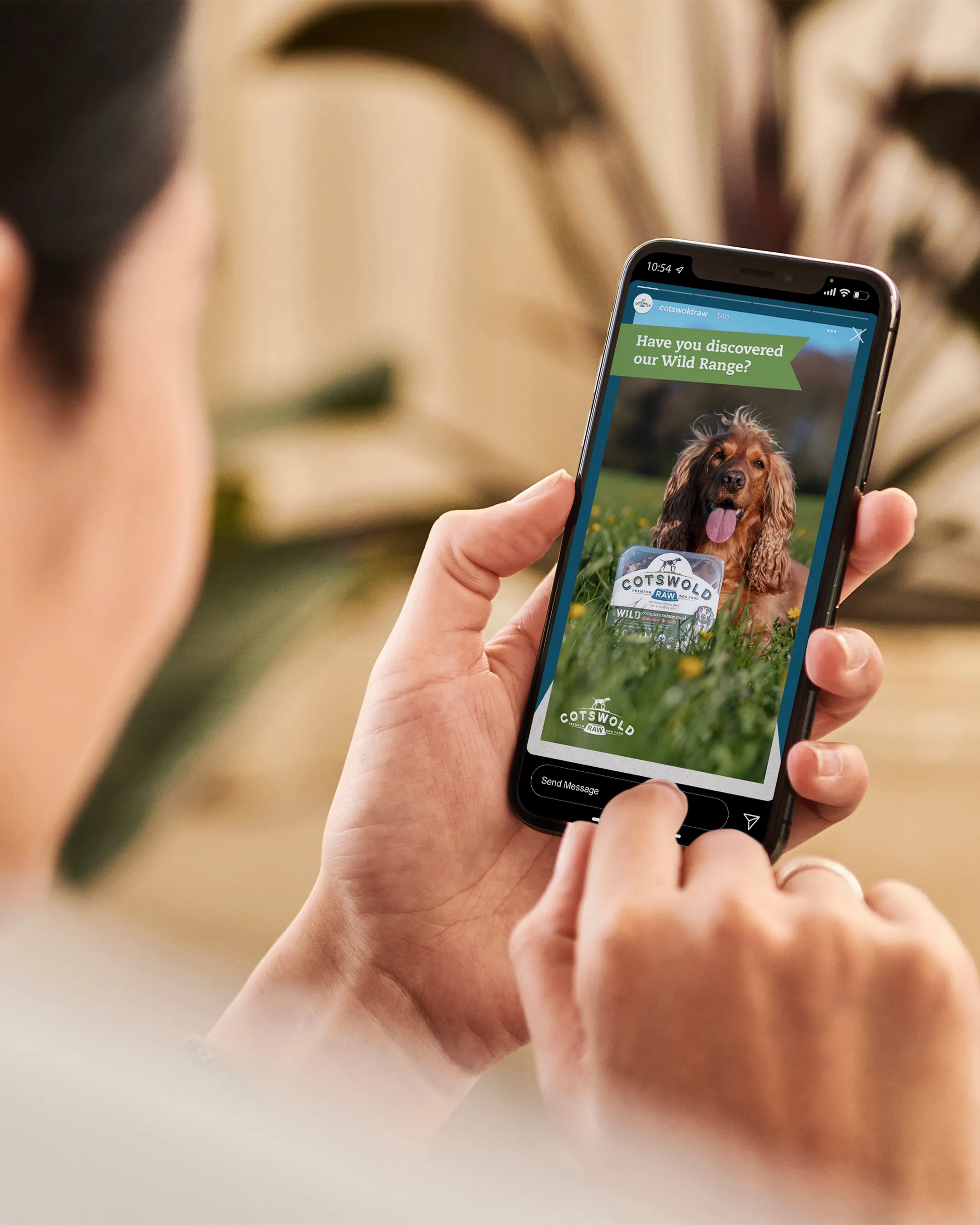
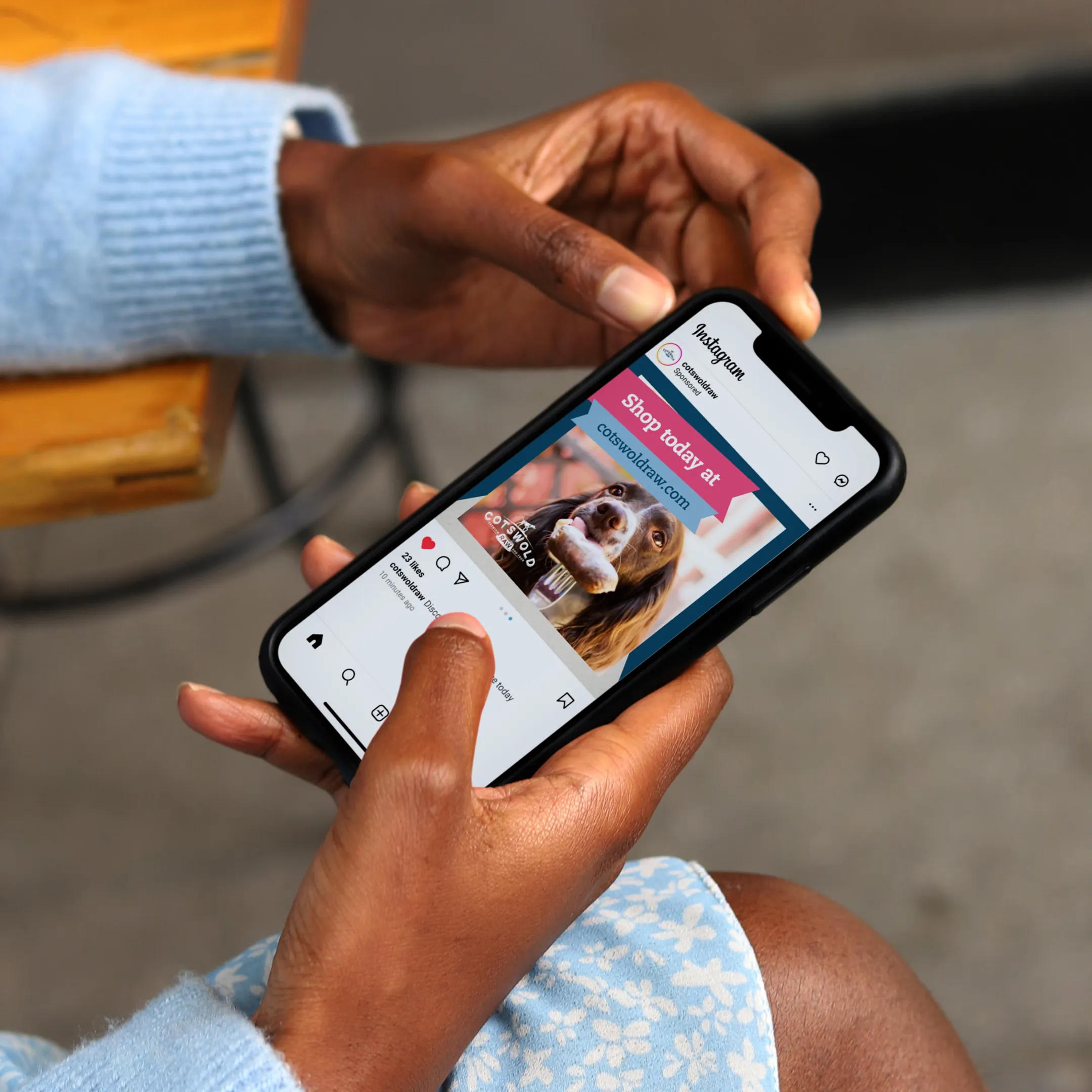
This created a set of feeding guides that are easier to navigate and more engaging to use, with the visual language extended across supporting social media assets.
Other projects

View all work
→
Cotswold RAW
Editorial Design
Digital Design
Social Media Design
Cotswold RAW is a family-run pet food brand producing natural raw meals for dogs and cats. Their feeding guide booklets had gradually become overloaded with information, making important nutritional advice difficult to find when customers needed it.
I redesigned the guides around a stronger information hierarchy, reorganising content to improve the way it is read and understood in real use.
A more structured interpretation of the brand’s collage-led style, supported by a broader use of the existing colour palette, created clearer separation between sections while retaining the personality of the brand.
This created a set of feeding guides that are easier to navigate and more engaging to use, with the visual language extended across supporting social media assets.
Other projects
View all work
→
Cotswold RAW
Editorial Design
Digital Design
Social Media Design
Cotswold RAW is a family-run pet food brand producing natural raw meals for dogs and cats. Their feeding guide booklets had gradually become overloaded with information, making important nutritional advice difficult to find when customers needed it.
I redesigned the guides around a stronger information hierarchy, reorganising content to improve the way it is read and understood in real use.
A more structured interpretation of the brand’s collage-led style, supported by a broader use of the existing colour palette, created clearer separation between sections while retaining the personality of the brand.
This created a set of feeding guides that are easier to navigate and more engaging to use, with the visual language extended across supporting social media assets.
Other projects
View all work
→