Desotec
Brand Identity
Creative Concepting
Desotec is a European environmental services company providing sustainable mobile filtration solutions for industrial clients. Through the use of activated carbon filter tanks, they help businesses treat and purify emissions by removing pollutants from air, water and soil.
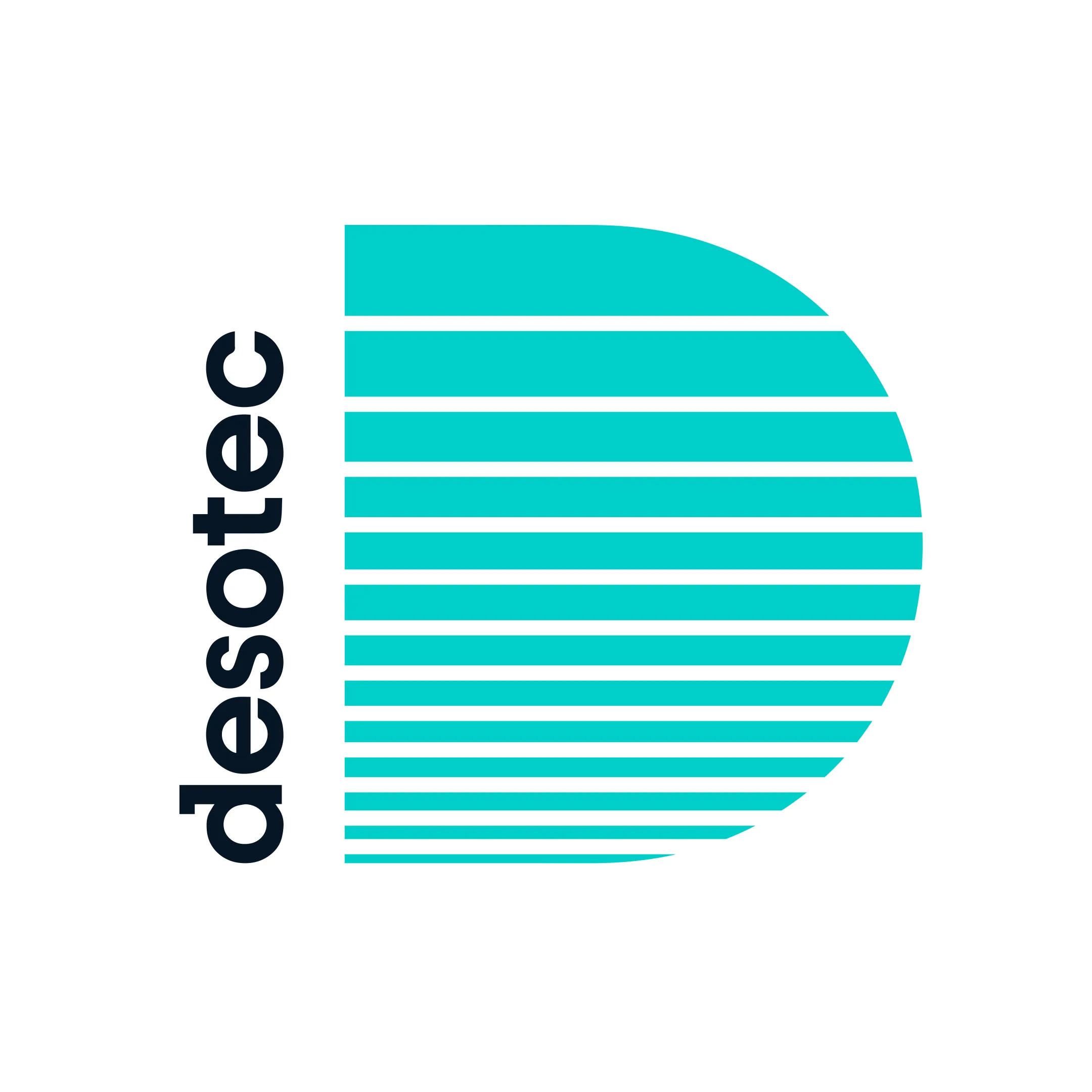
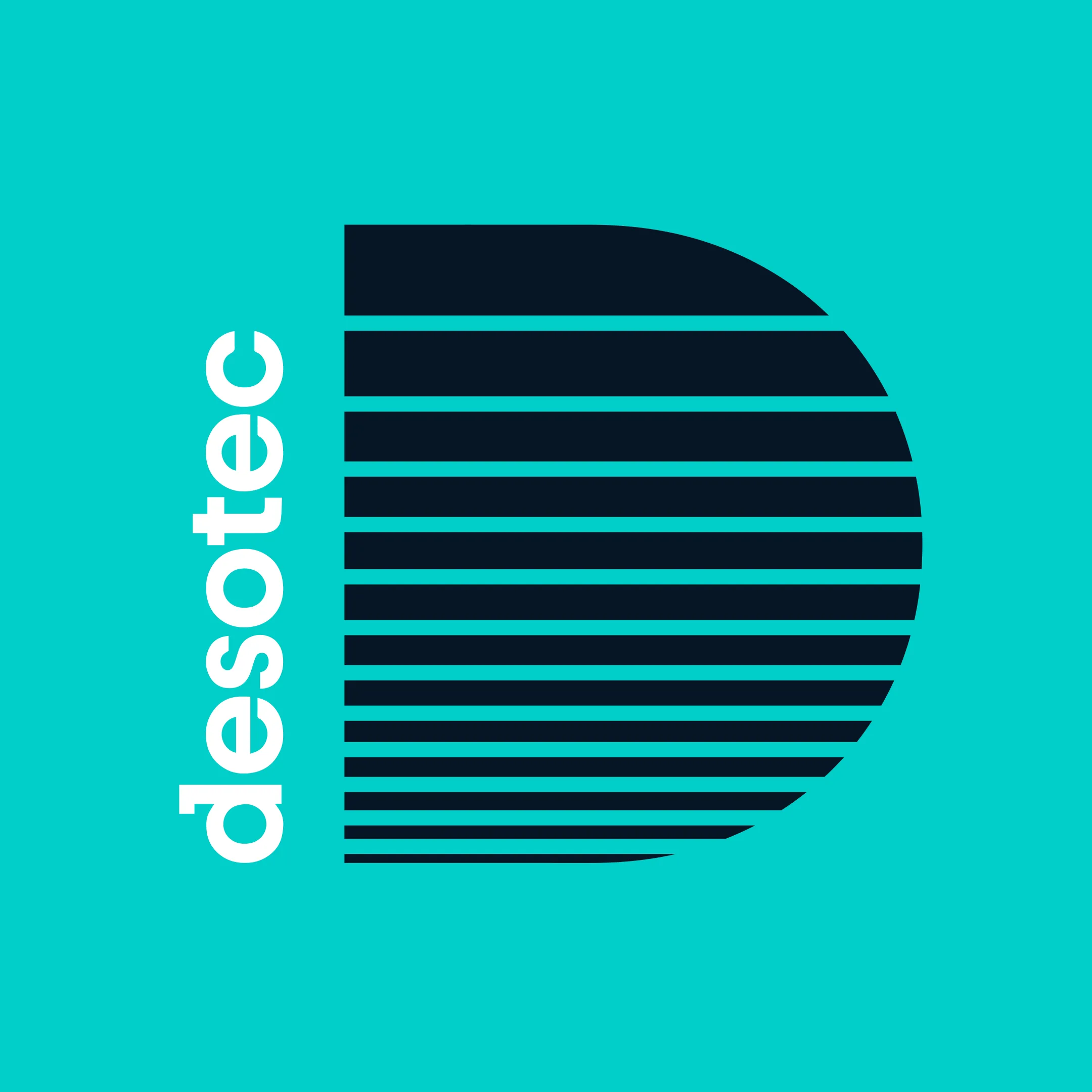
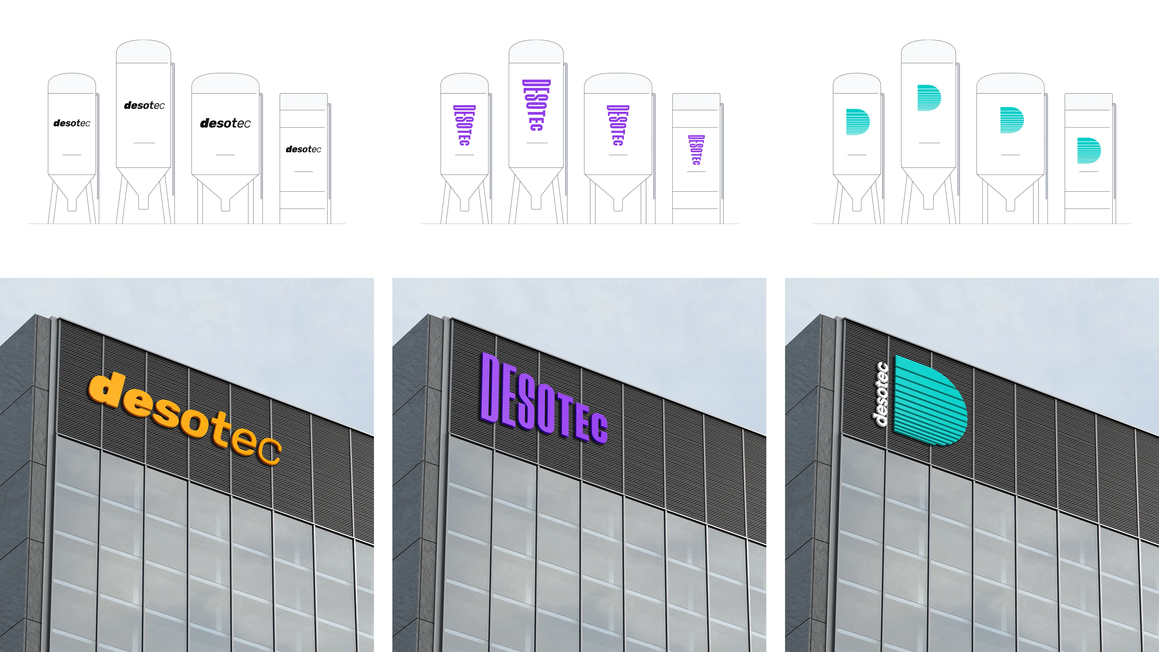
As part of a brand identity pitch, I developed a series of logo concepts exploring how the filtration process could be reflected through form, structure and simplicity. I tested different visual approaches before applying the concepts to mockups to demonstrate how each direction could work in context.
The result was a considered set of logo directions, showing different ways the brand could be visually defined and providing a foundation for how its identity could evolve.
Other projects
View all work
→
Desotec
Brand Identity
Creative Concepting
Desotec is a European environmental services company providing sustainable mobile filtration solutions for industrial clients. Through the use of activated carbon filter tanks, they help businesses treat and purify emissions by removing pollutants from air, water and soil.
As part of a brand identity pitch, I developed a series of logo concepts exploring how the filtration process could be reflected through form, structure and simplicity. I tested different visual approaches before applying the concepts to mockups to demonstrate how each direction could work in context.
The result was a considered set of logo directions, showing different ways the brand could be visually defined and providing a foundation for how its identity could evolve.
Other projects
View all work
→
Desotec
Brand Identity
Creative Concepting
Desotec is a European environmental services company providing sustainable mobile filtration solutions for industrial clients. Through the use of activated carbon filter tanks, they help businesses treat and purify emissions by removing pollutants from air, water and soil.
As part of a brand identity pitch, I developed a series of logo concepts exploring how the filtration process could be reflected through form, structure and simplicity. I tested different visual approaches before applying the concepts to mockups to demonstrate how each direction could work in context.
The result was a considered set of logo directions, showing different ways the brand could be visually defined and providing a foundation for how its identity could evolve.
Other projects
View all work
→